AI Research Community Branding
Complete brand identity for a non-profit AI research organization Pseudo Lab (가짜연구소) logo system, branded goods, social media templates, presentation decks, plus event photography, videography, and motion graphics. Visual language designed to communicate their research mission.
Project brief.
Goal and Objectives
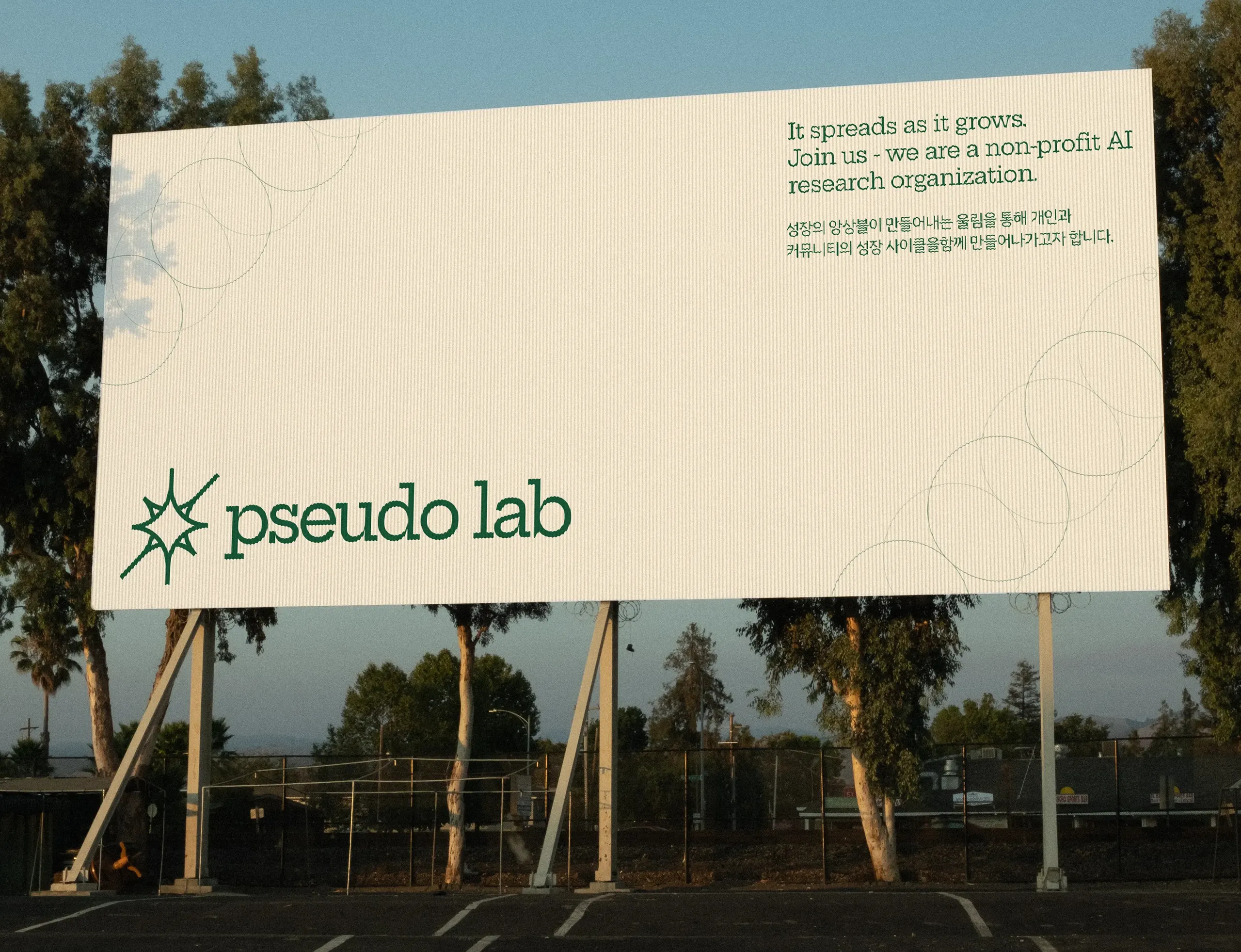
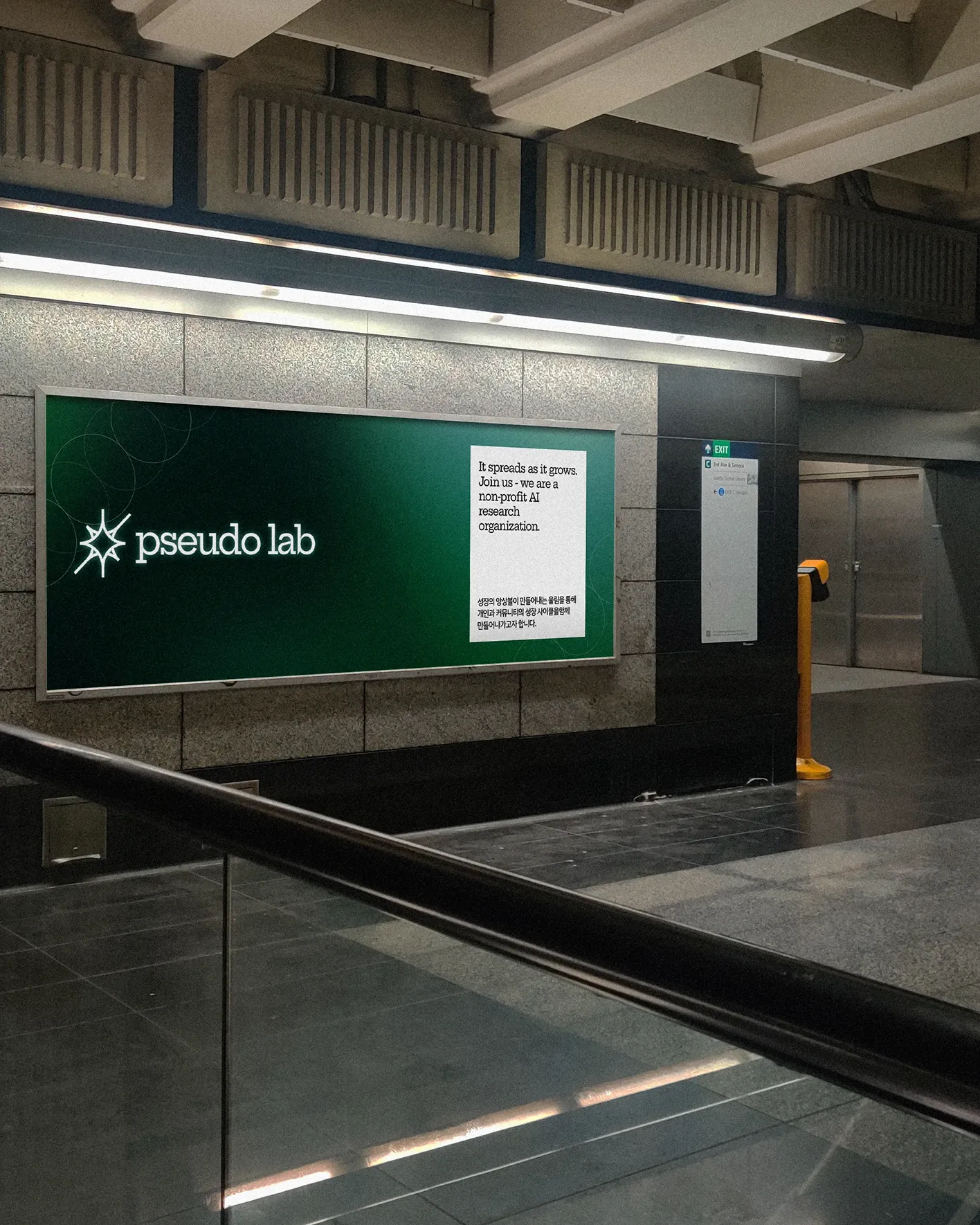
Build a brand identity that captures the spirit of a collaborative AI research community. The organization brings together passionate individuals who grow through shared projects and knowledge exchange. The identity needed to feel modern, growth-oriented, and energetic — reflecting the community's enthusiasm — while standing apart from the polished but distant corporate identity of major AI companies. The challenge was communicating 'connection' and 'positive energy' visually while maintaining the credibility needed for a research organization.
Challenge
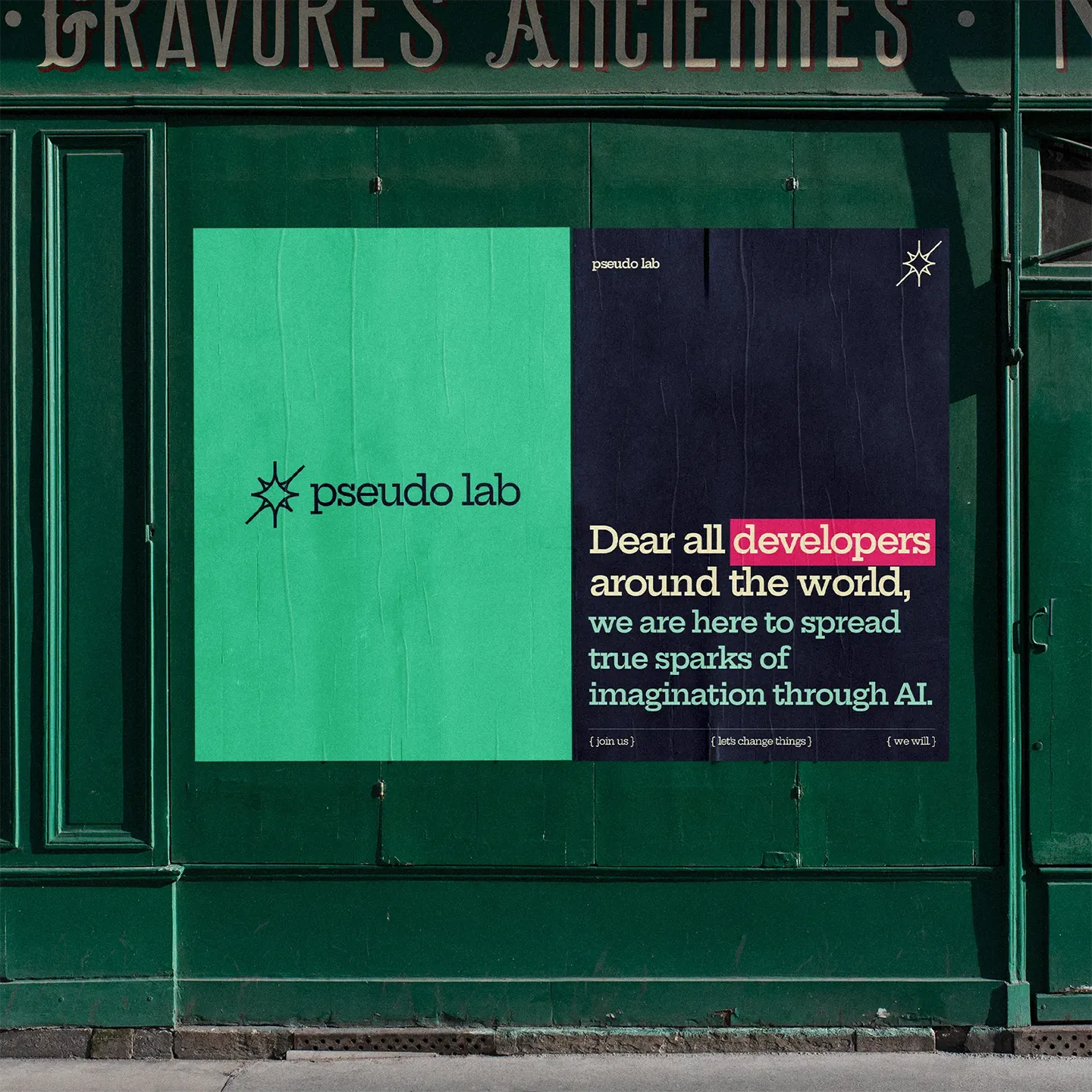
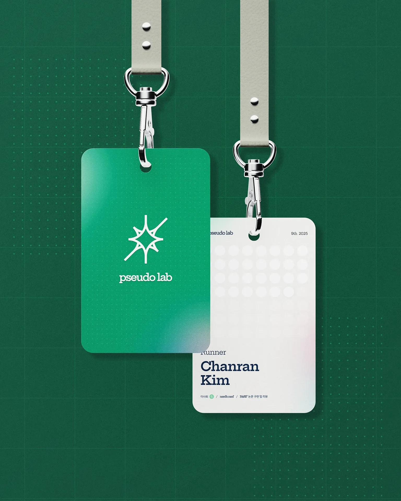
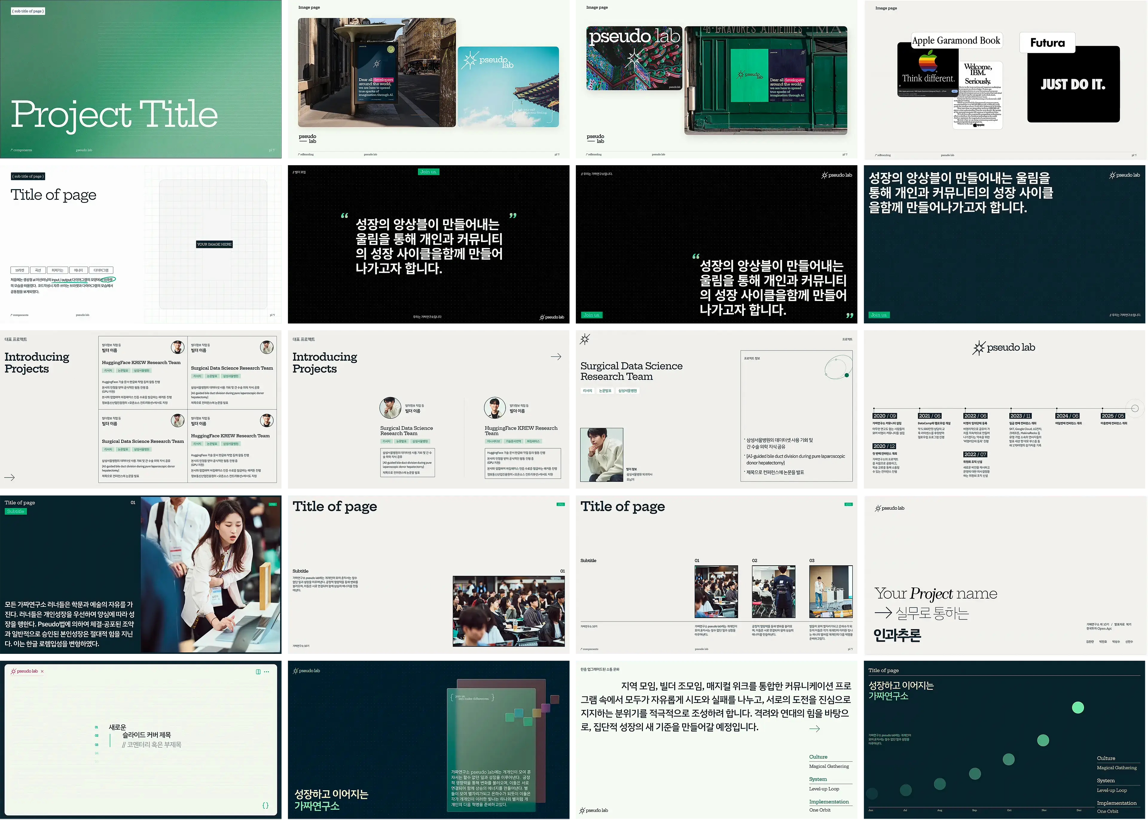
Every project has its own keystone.Finding a developer-appropriate symbol that didn't look generic was the challenge. Semicolons, code symbols, and geometric shapes are everywhere in tech branding. The breakthrough: recognizing that the middle of a code bracket "{" is half of a star shape. By deconstructing the bracket and rebuilding it as a star, the symbol captured both their technical roots and their philosophy of connection and spreading energy. Combined with a slab-serif typeface, it felt modern and credible while avoiding the cold corporate aesthetic. The symbol worked because it wasn't borrowed — it was transformed with intentional meaning.
- Art direction 01
- Branding strategy 02
- Graphic Design 03
- Imagery / Video 04
Scope
- Identity system 01
- Logo design 02
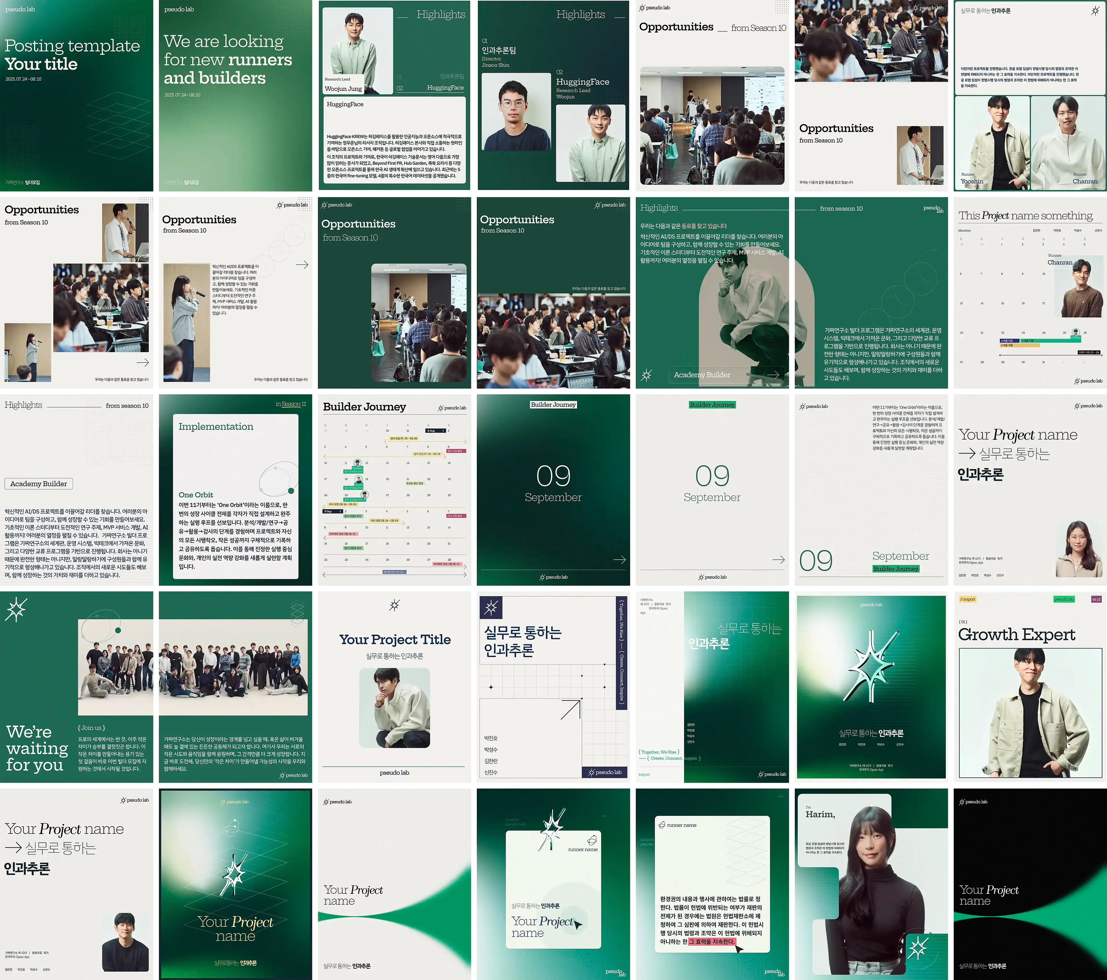
- SNS contents design 03
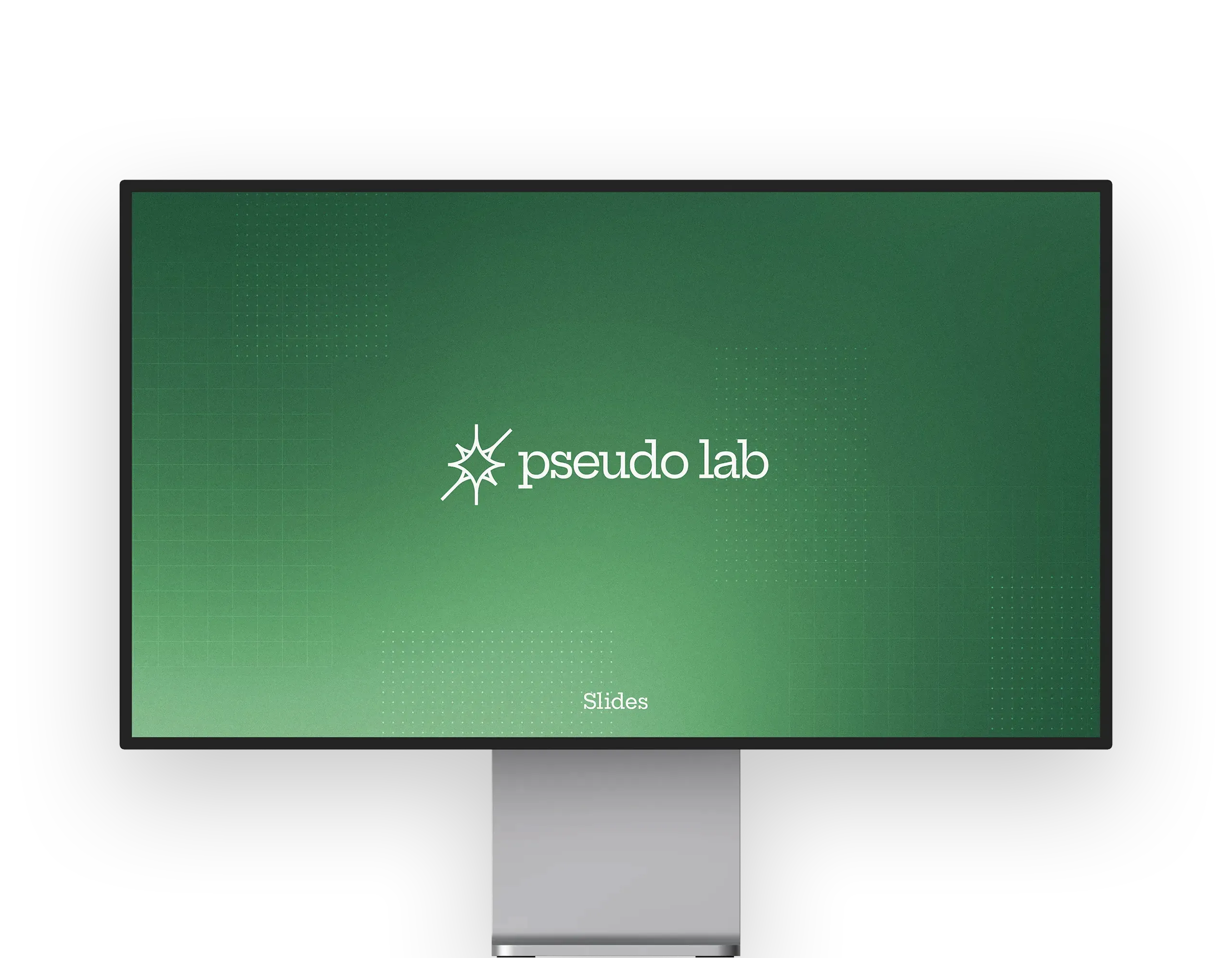
- Slides design 04
Deliverables
Identity
Concept / Logo / Branding System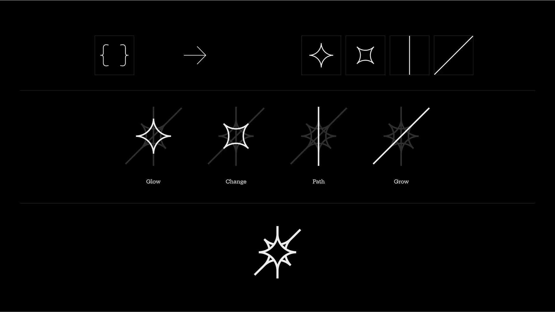
Digital experience
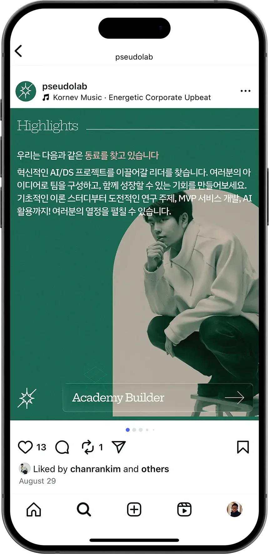
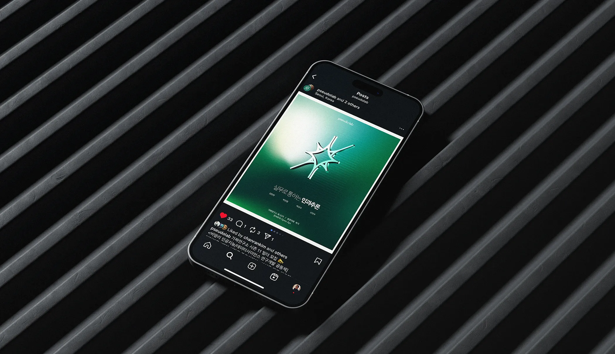
SNS contents - Instagram & Linkedin
General Branding
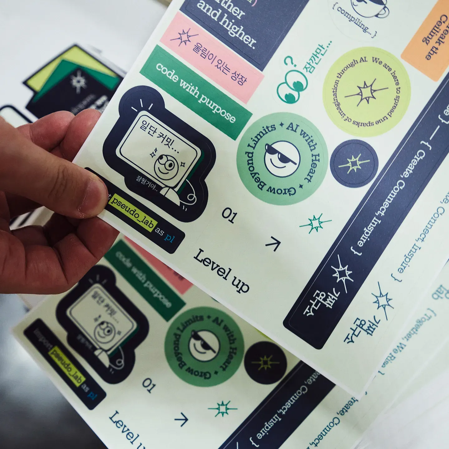
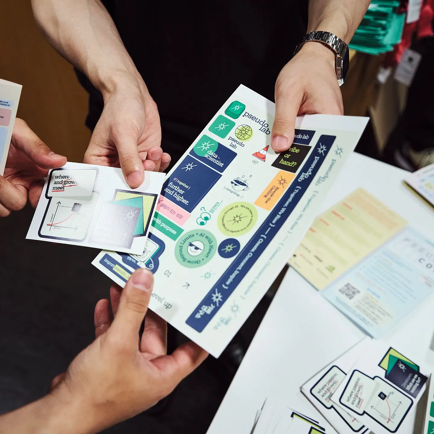
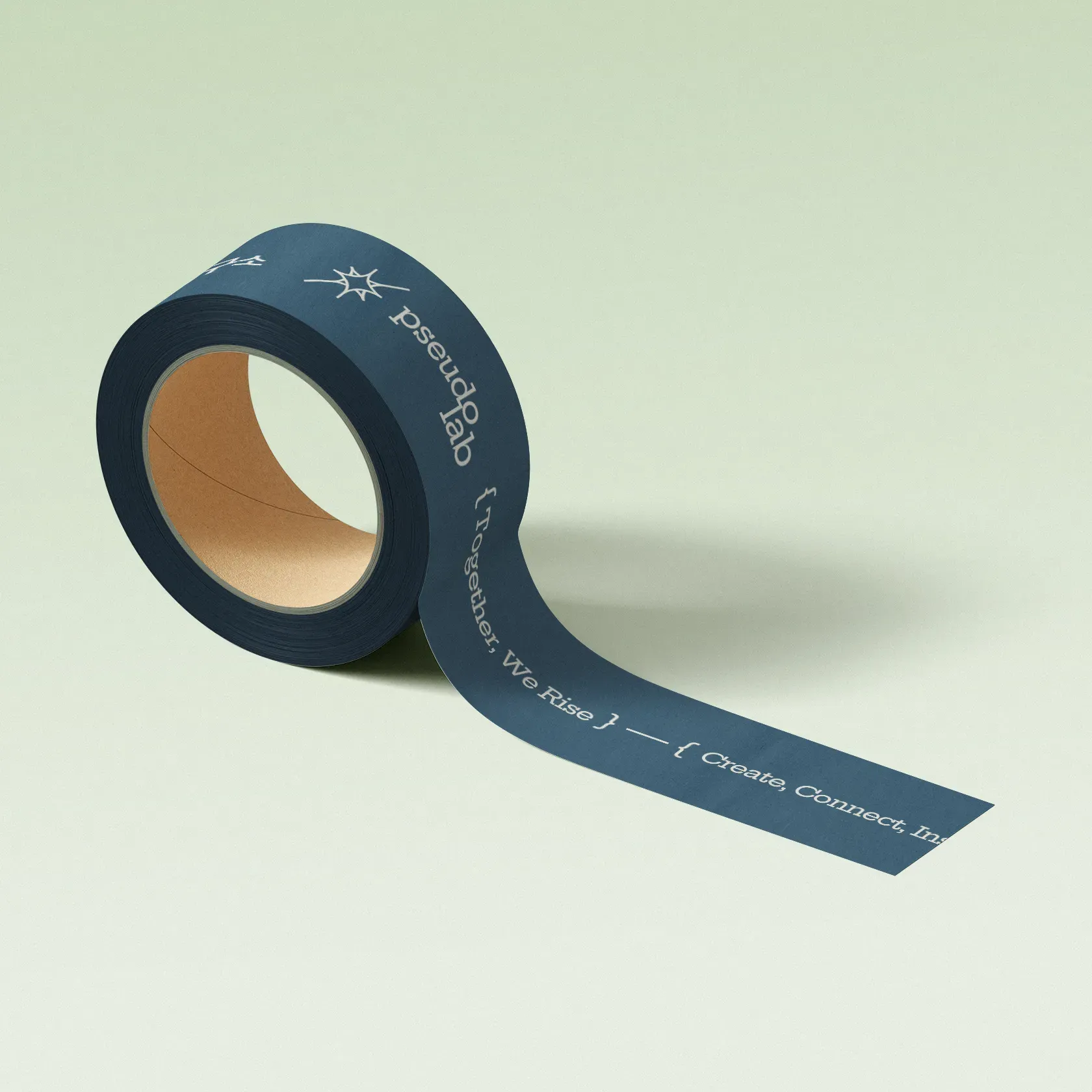
Branding assets